CeleBreak
Giving players a reason to come back.
Better-matched games. Familiar faces. A reason to play again.
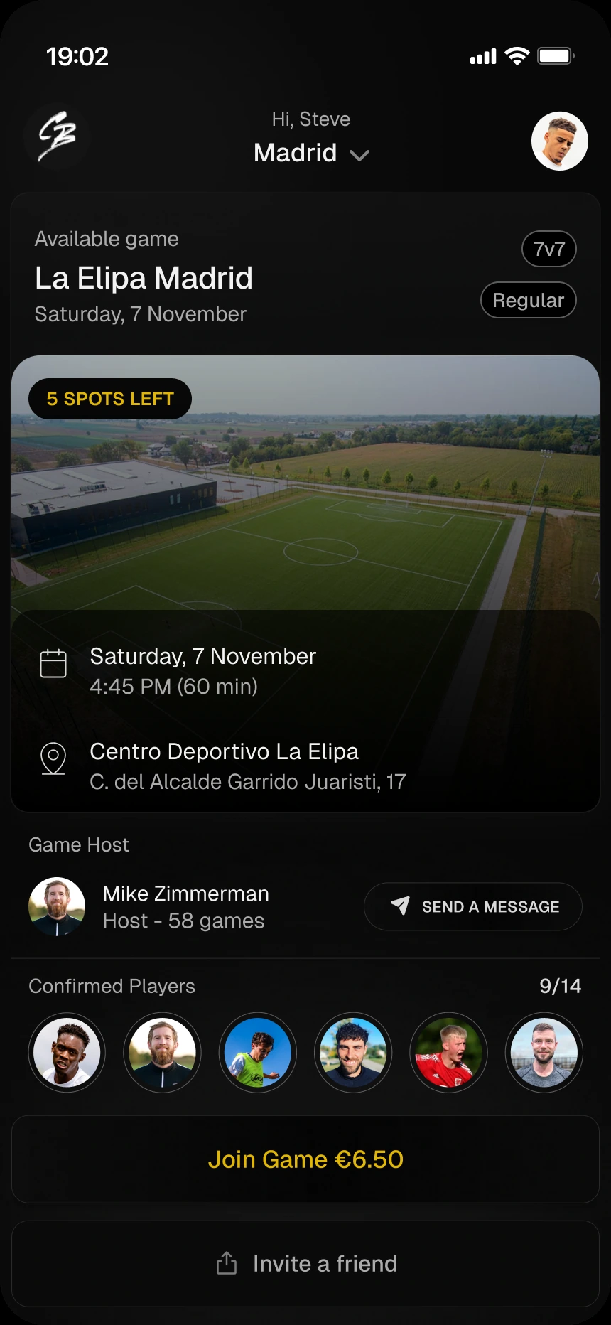
Challenge:
Booking a game was only the beginning. CeleBreak wanted more players to return: a mismatch in playing level could spoil the experience, while meeting the right people could make the next game more inviting. In a seven-day hiring challenge, I explored how the app could support both. Three exploratory interviews with football players in Brazil helped inform the proposal.
- My role
- UX/UI designer
- Scope
- Product thinking · Mobile UX/UI
- Team
- Individual hiring challenge · 2022 · 7 days
- Status
- Design proposal · UI revisited for this portfolio
Originally designed in 2022 for a hiring challenge. The interfaces shown here were later refined for this portfolio, building on the original product concepts. Implementation and retention outcomes are unconfirmed.
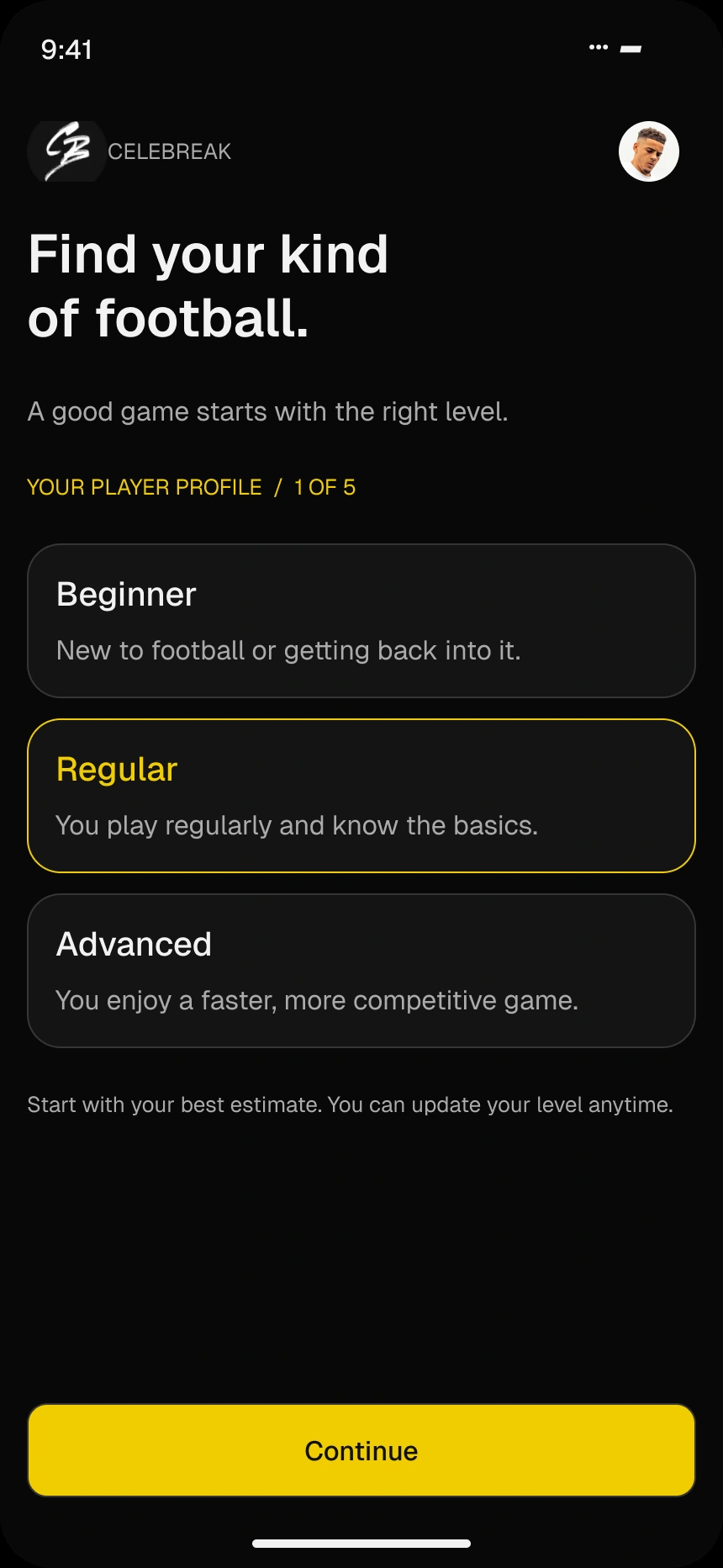
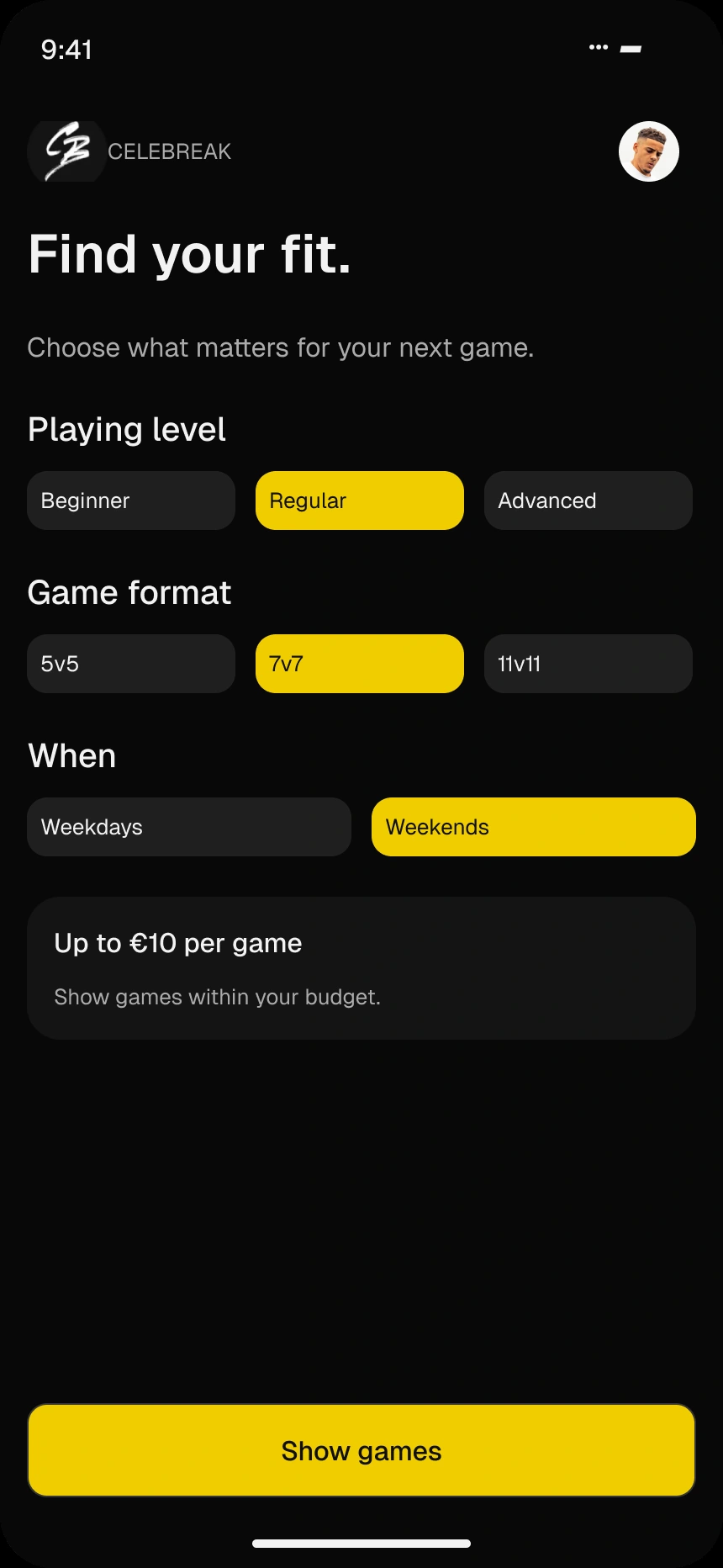
Beginner, regular or advanced means little without context. I paired each level with a short explanation, helping players choose a starting point before looking for a game. That preference could then make discovery more relevant.
Your game.
Your level.
A shared understanding
before the first kick.
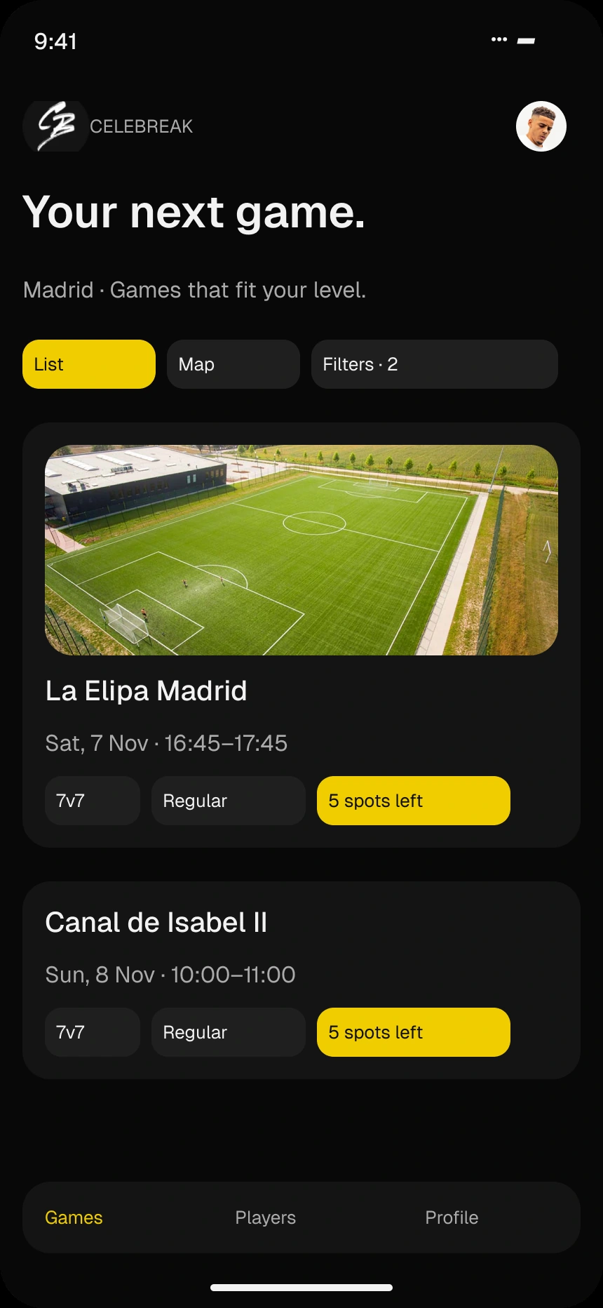
A long list of games asks players to do the matching themselves. Filters bring level, format and availability into the decision, while game details keep the venue, host and remaining places close to the booking action.
Less searching.
More playing.
The concept carried matching into the game itself. Team formation considered level and position, with the host still visible as a point of contact. This made the proposed balance tangible; the rating system and its effectiveness would still need validation.
A good game
starts with
the mix.
Playing level.
Preferred position.
A host to bring it together.
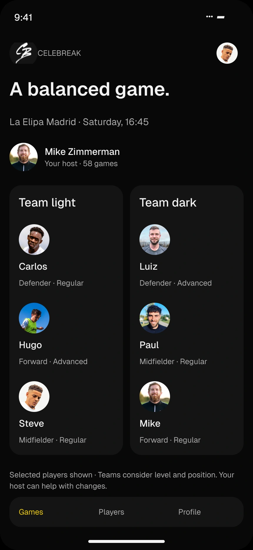
Concept illustration · Selected players shown, not a complete team roster.
Community did not need to start with a full social network. I used a simpler connection: people who had already played together. A player list and lightweight profiles made those familiar faces easier to find again.
Same pitch.
Next time, familiar faces.
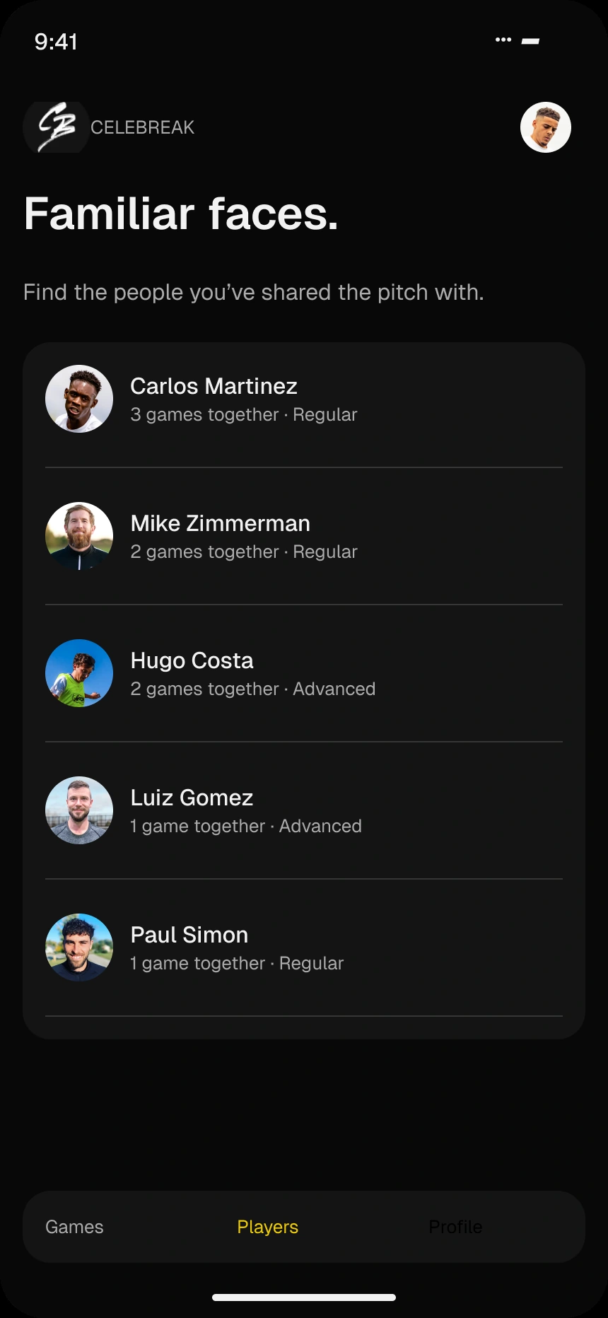
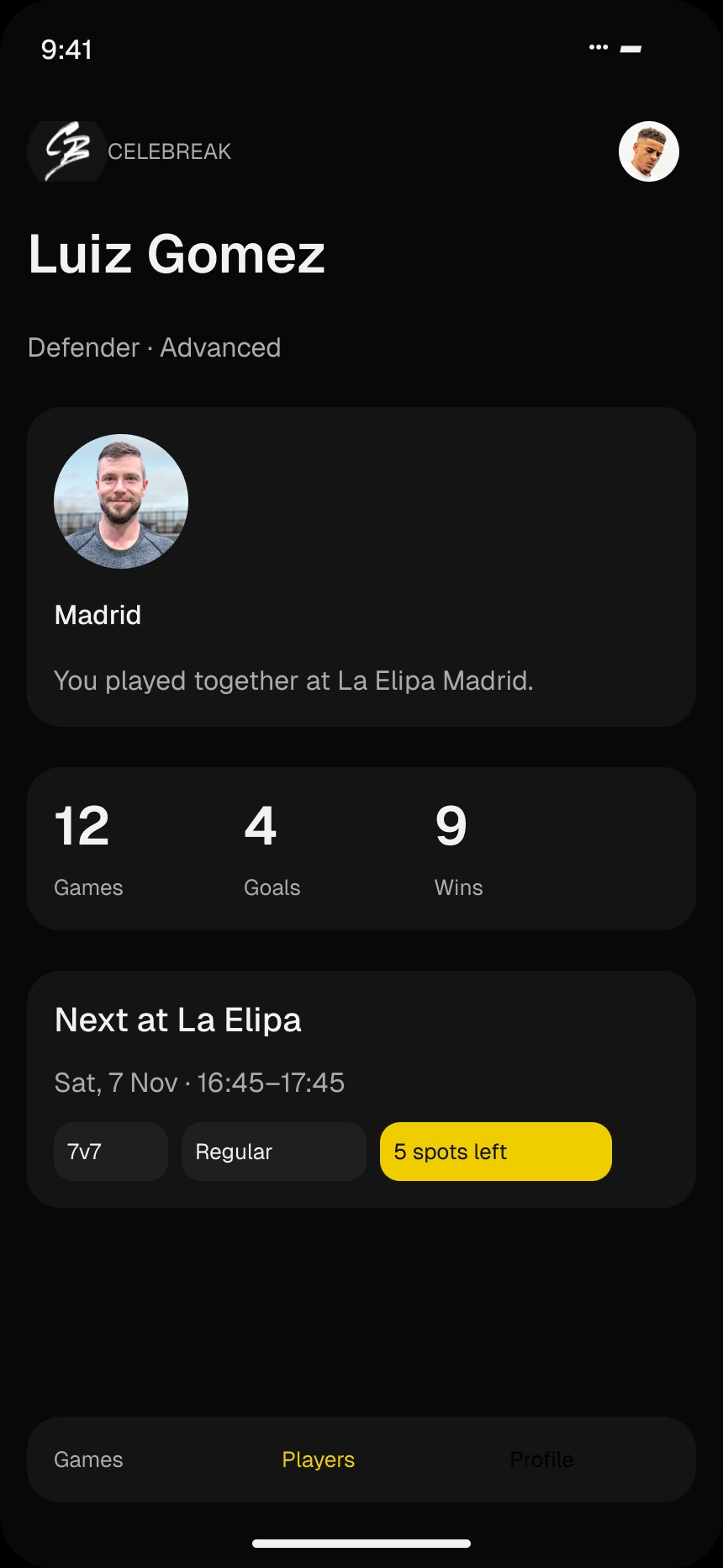
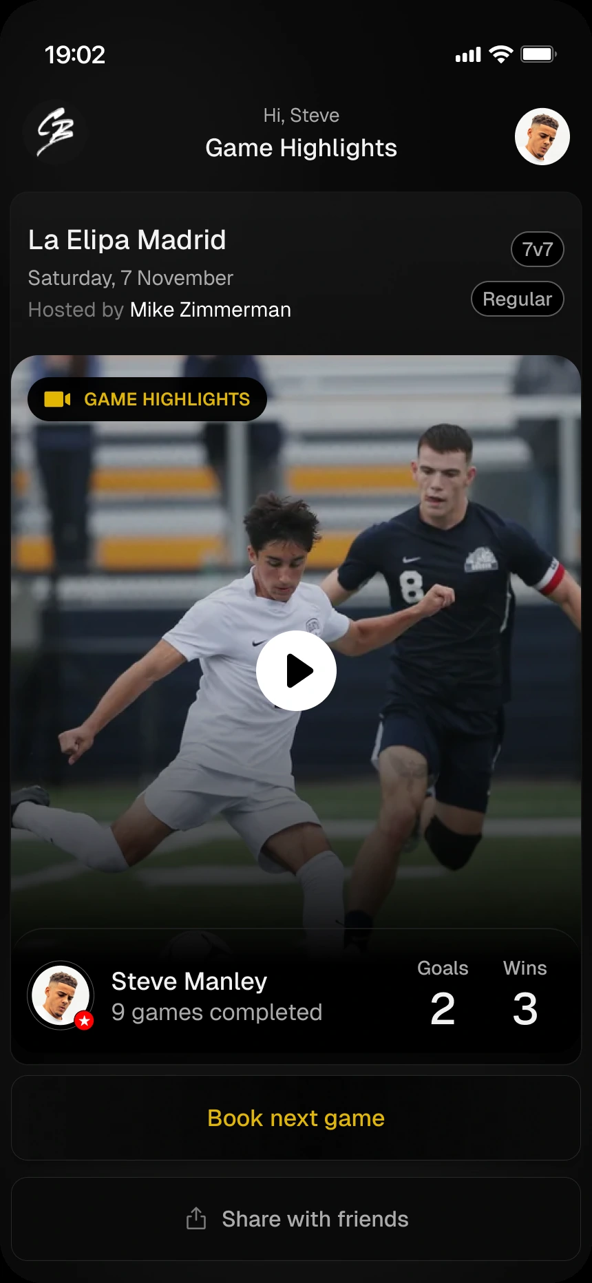
The original proposal celebrated participation and surfaced player statistics after a match. The later visual exploration brought that moment into a highlights-led screen, with a clear invitation to book again. The experience should remain useful when a game has no video available.
The final whistle.
The next invitation.
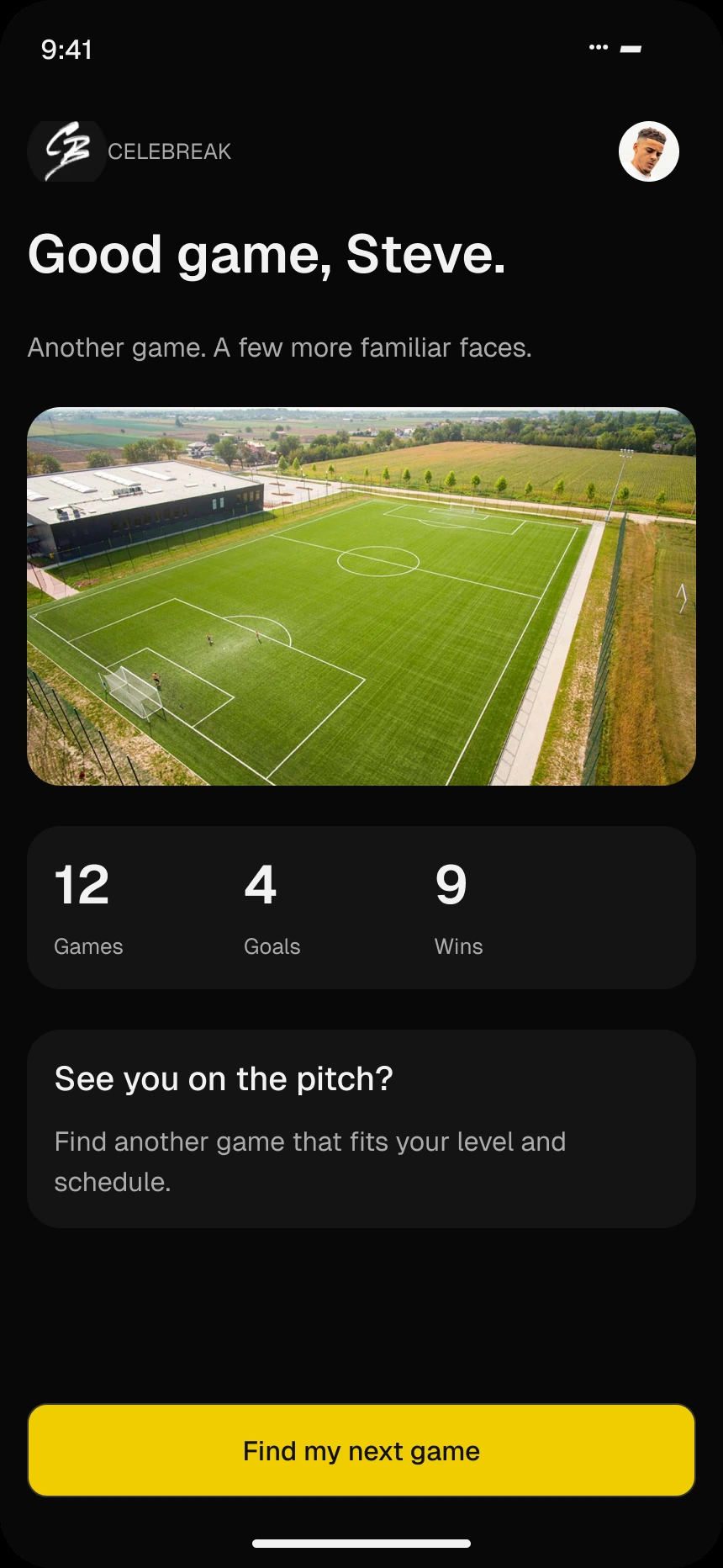
Portfolio UI refinement · Video, names and statistics are example content.
The seven-day challenge resulted in connected mobile flows for finding a suitable game, meeting other players and returning after the match. It turned a retention question into a concrete product proposal. The next step would be testing those interactions and whether they actually help players come back.