FLYTE
Turning an early vision into a first concept
Shaping Flyte’s first mobile web experience, from an early vision to flight forecasts, alerts and an MVP foundation.
CHALLENGE
Flyte’s founder had a vision: help travelers anticipate flight disruptions before their plans fell apart. I joined with a deck, a logo, survey findings and early mockups. As the only designer, I worked directly with her to turn those pieces into a clear product experience and define what the first version should do.
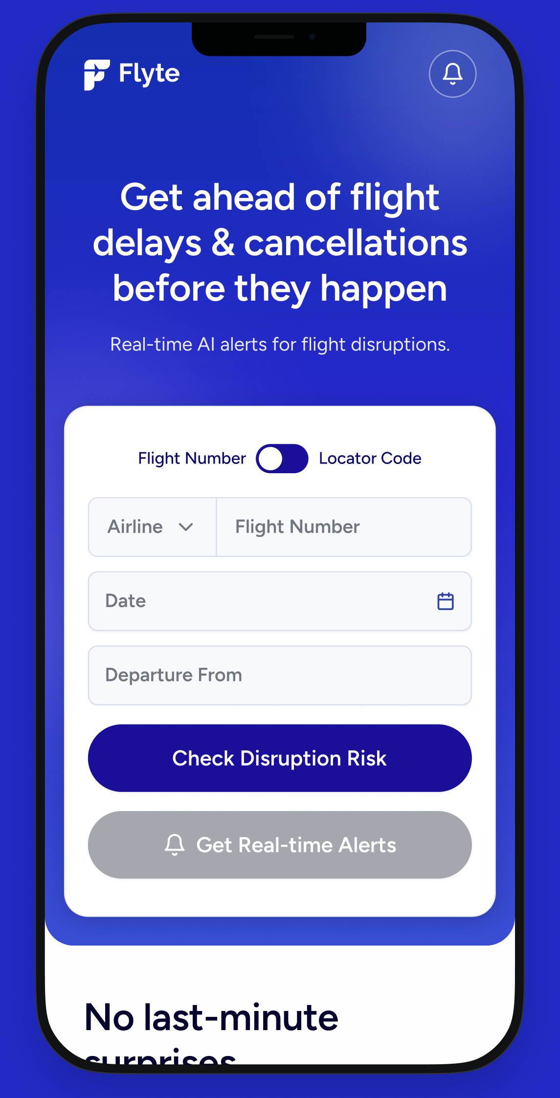
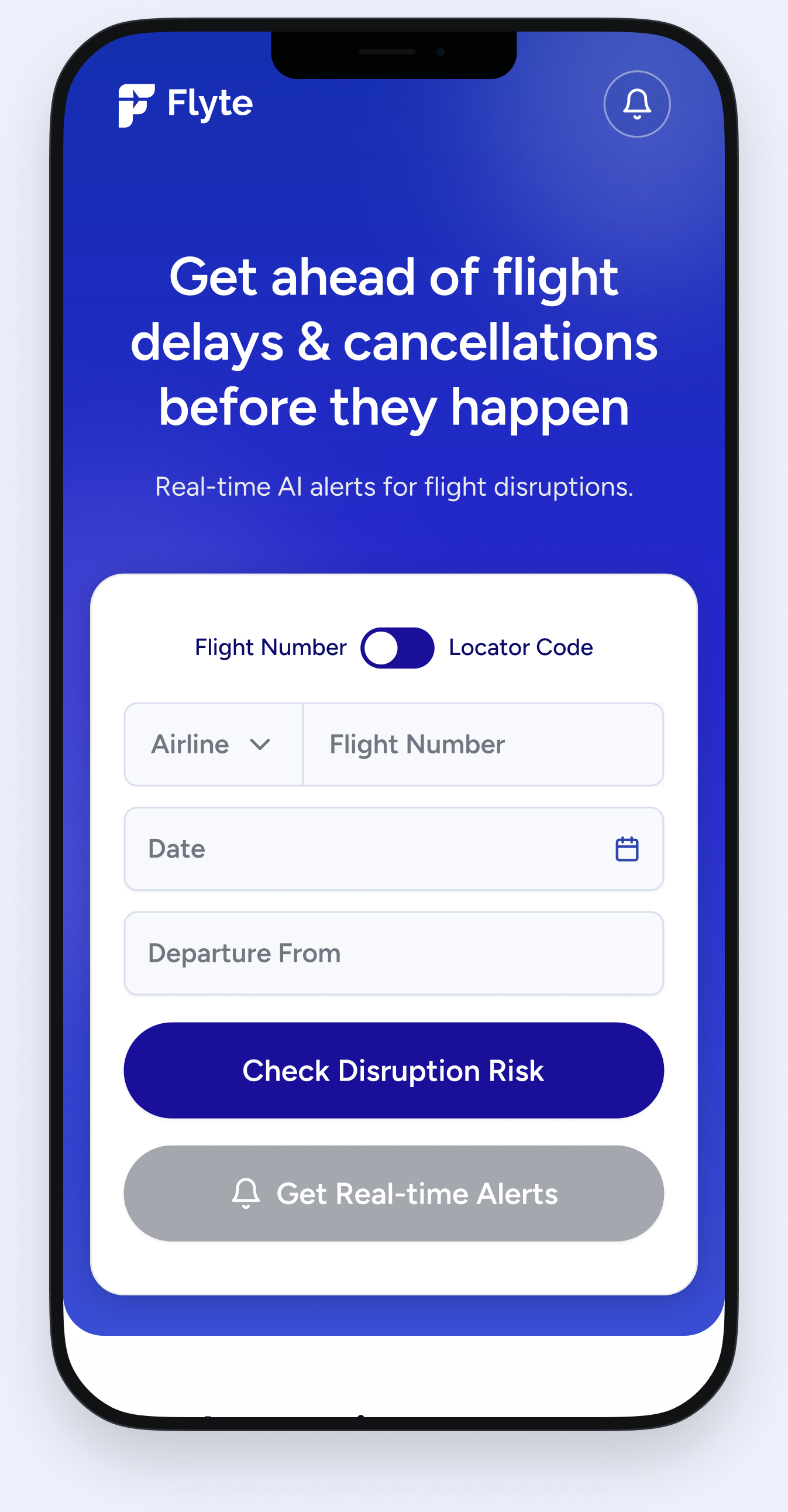
Asking occasional travelers to install another app would put a barrier before the value. I proposed starting on the web, with a free flight-risk check before signup. Enter a flight, get useful information, then register to stay informed.
Value first.
Commitment later.
No download.
No initial paywall.
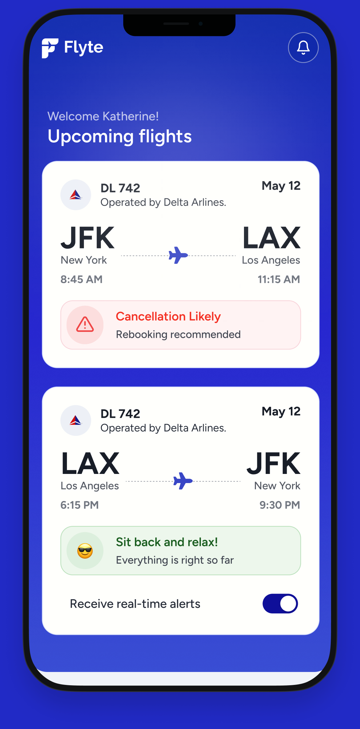
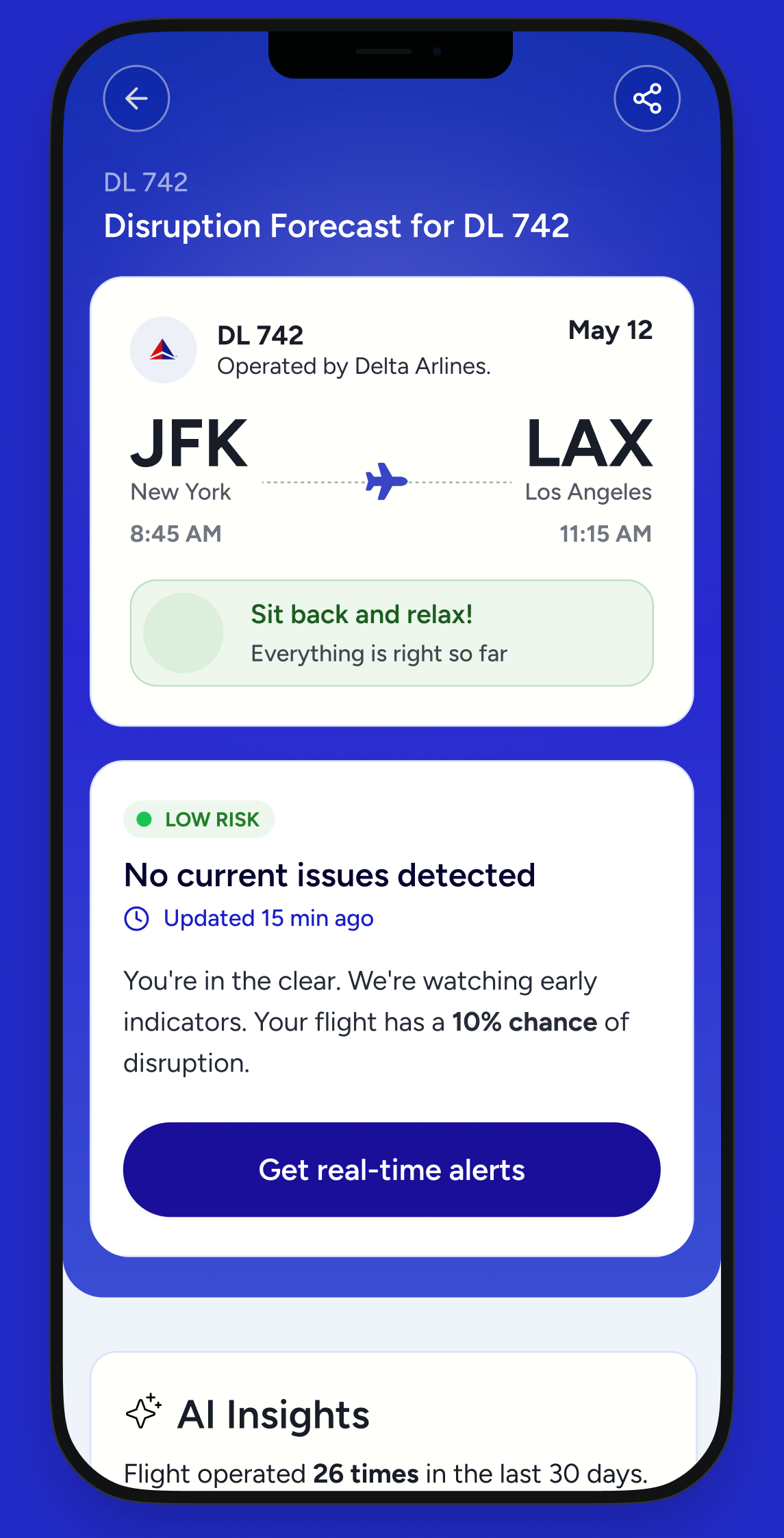
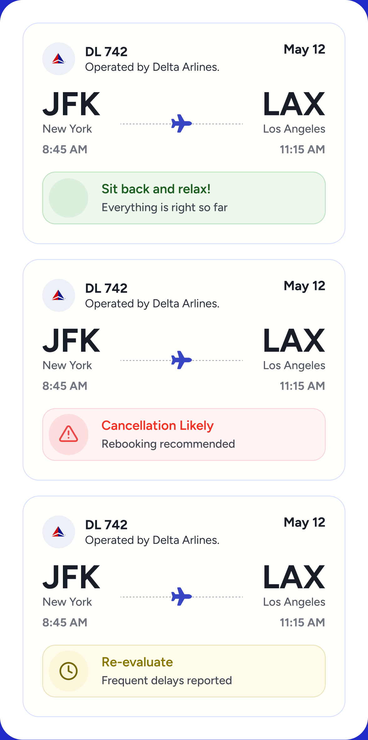
A risk score alone leaves the traveler to decide what it means. I defined three levels of risk, each with a recommendation and a next step. The language needed to inform without creating panic, while making clear that a forecast is a probability, not a certainty.
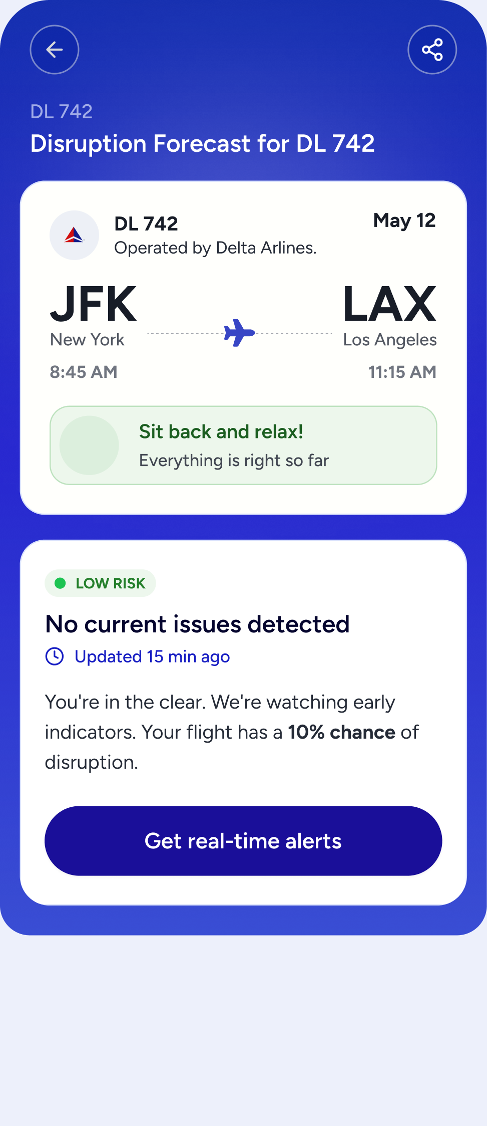
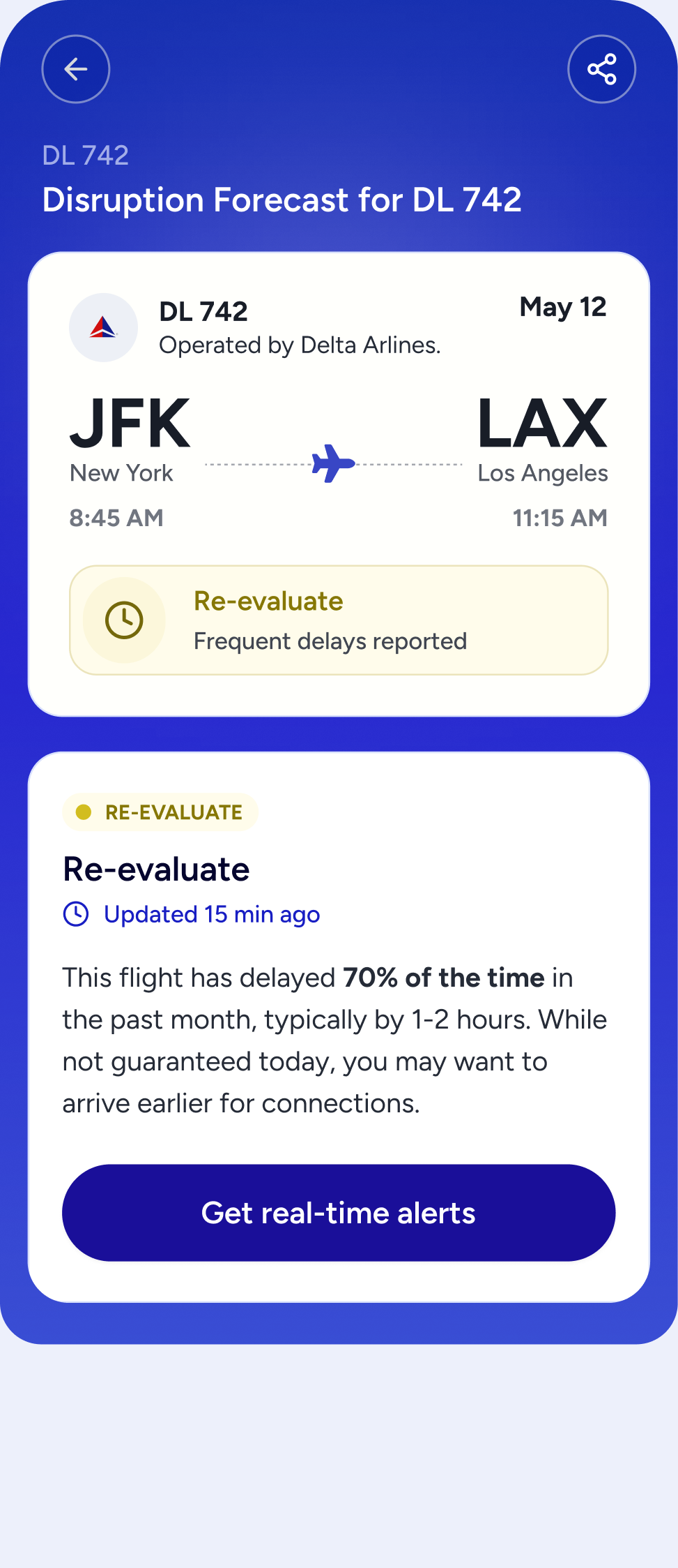
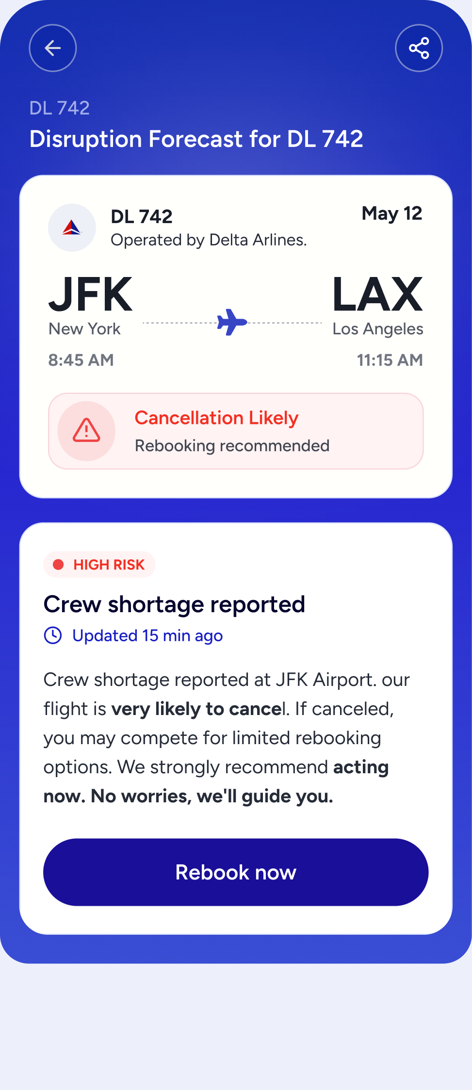
The next commitment had a clear purpose: receive updates about a flight. I connected signup to a short setup flow, with ways to add a return flight, remove one and control alerts.
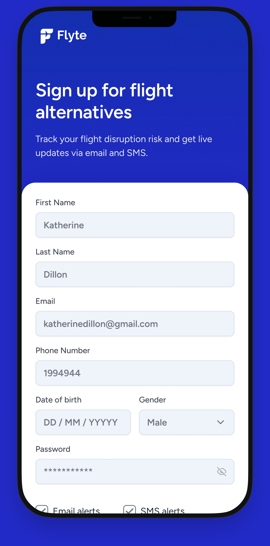
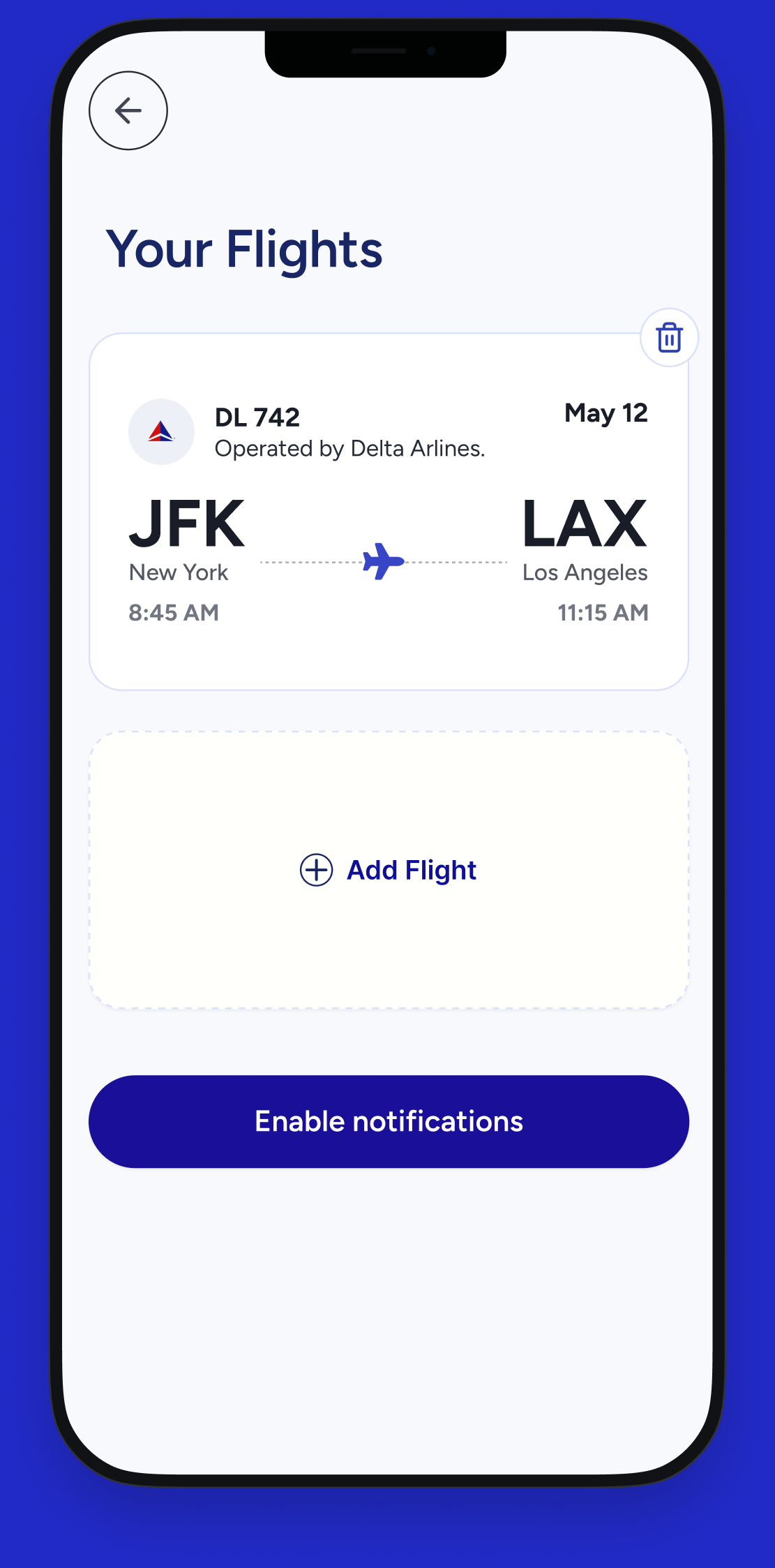
The predictive model was being built in parallel, so I designed with scenarios rather than live data. Regular conversations with the founder helped clarify assumptions and the information each state would need. Model accuracy and how to explain the methodology remained questions to validate before launch.
I also explored the journey from an alert to an alternative flight: preferences, a short list of options and checkout. This helped make the broader vision tangible, but the initial product would focus on the risk check, signup and alerts.
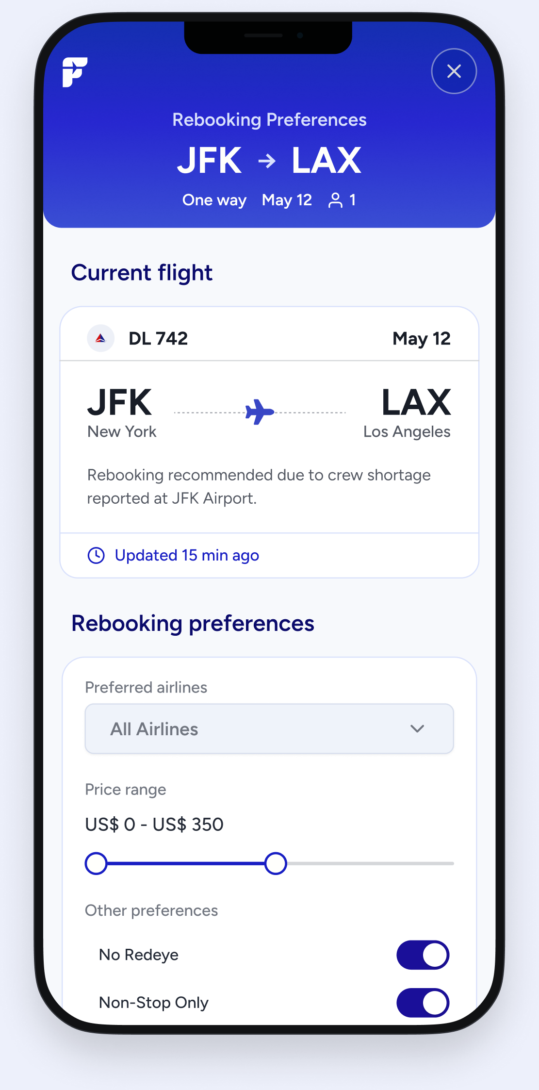
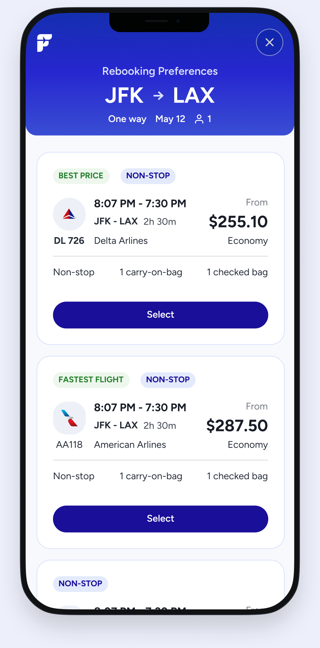
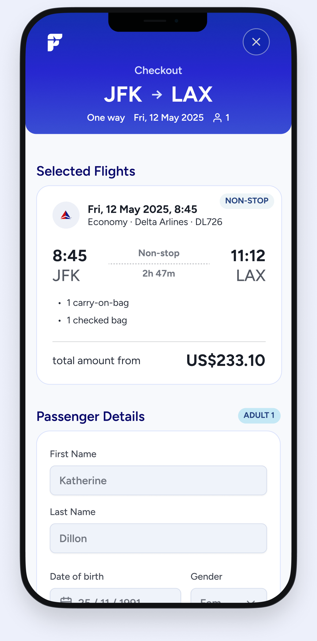
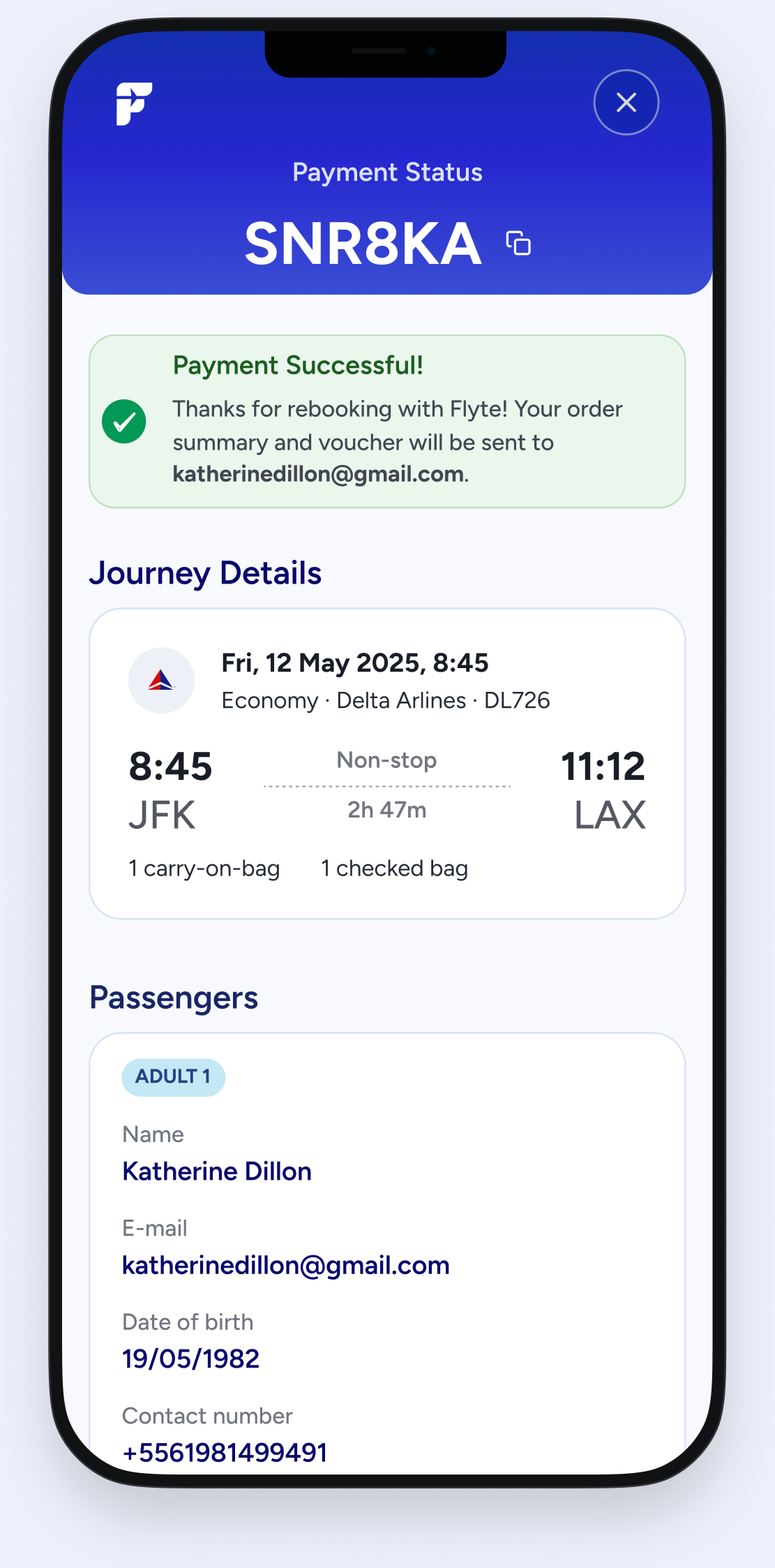
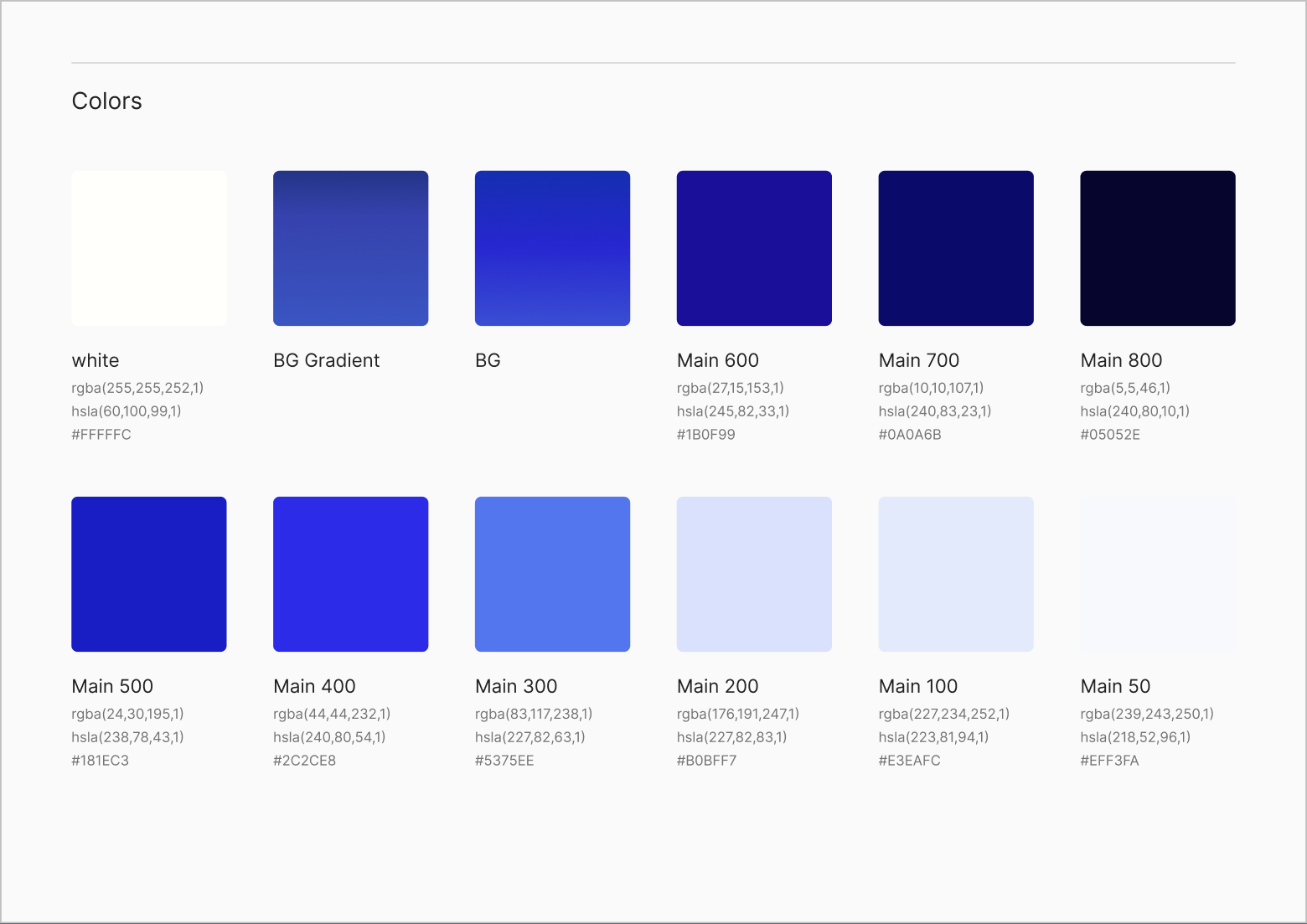
As the experience took shape, I organized its visual language into reusable components and patterns that would serve as a foundation for a future design system.
Built once.
Connected throughout.
Flight cards, risk states and a consistent palette form the foundation for the next stage.
With the core journey defined, the priority was giving the founder a coherent, streamlined first product to validate and a useful foundation for engineering.
“Being able to see it come from just an idea… It obviously needs data, but it looks amazing.”
In a few sprints, I turned the founder’s early vision into a tangible mobile web experience, with a defined initial scope and documented designs. She planned to use the work with investors and to guide MVP implementation.